An album cover gives you a preview of the music before you even hear it. The music itself is a great way of knowing upcoming trends; but in the design world we should be looking at the album art. It is a great way to get a glimpse of what’s to come.
Throughout history many musicians have used album art and concert posters to not only promote their names but to evoke a certain feeling from their audience. Musicians have used designers and artists to the best of their advantage. Through designers and artists they were able to reach a larger audience, and get their message across. You could say that the album art is just as important as the music itself.
These upcoming and new CD’s consist of phenomenal design and art that should be inspiring to all. You can develop a sense of future trends in music, fashion, and most importantly; design. By looking at these designs you are experiencing the newest trends; and it’s important to keep up with that.
Even if your niche is based on logo design (for example), looking at these designs can still benefit you greatly. You can look at the type and how it is laid out. On album covers the type has to state the name of the CD and the name of the artist. It’s good to look at how these designers and artists differentiated the difference.
Also, by looking at these covers you can see the new trends in color. Color is always important; it could make or break a good design. Some colors evokes certain types of feelings in people, and it is important to know those colors and peoples subconscious feelings towards them.
These covers all have great color palettes, form, and layout set ups. If you examine these covers and take tips from them, it can better your designs. There is always room to learn new things as well as improving your own work. It is always essential to take a look at new and upcoming designs. Whether it is through magazines, websites, or through album covers. At the end of the day we are all designers, and we need to explore the design world together, through any means possible.
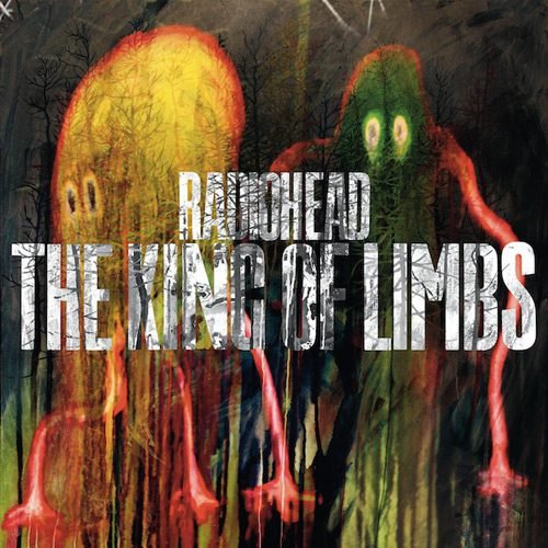
Radiohead – King Of Limbs
This takes the typical primary colors and adds a grunge look to them. The type stands on its on with being white, and being bold and tall. This evokes a mysterious feeling overall.
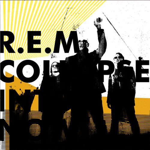
R.E.M. – Collapse Into Now
The softness of the yellows and white gives a relaxing vibe, but the black boldness of the type and band members adds a strong and powerful feeling.
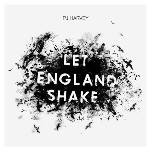
Pj Harvey – Let England Shake
The combination of black, white, and gray is always a pleasing one. They could have chose to go with a plain black paint splatter. Instead they played a trick with your mind and had that black splatter turn into birds. That adds depth to the whole album cover.
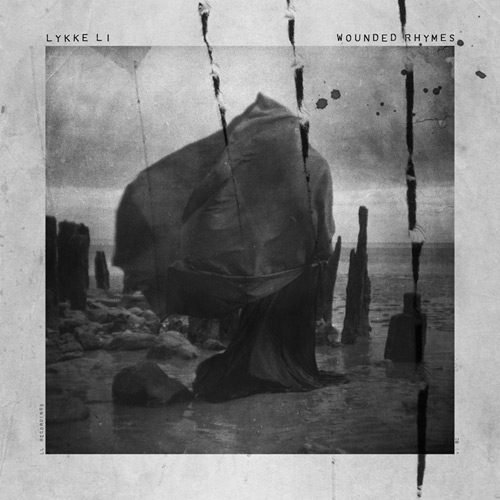
Lykke Li – Wounded Ryhmes
Looking at this you might think your looking at a vintage photo; and that’s great. The photo itself is beautiful, but with the added light gray border it makes it stand out so much more. Even with a layover of grunge like textures, this album cover still feels like a breath of fresh air.
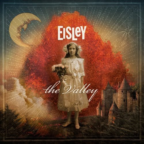
Eisley – The Valley
Yet again, another “dirty” take on well know primary colors. The image of the girl is a great starting point for the eye, leading right into the castle to the right. I don’t know what the story is, but this design defiantly is telling one.
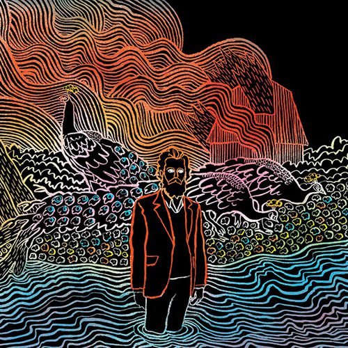
Iron And Wine – Kiss Each Other Clean
With this design your eye is automatically drawn to the man in the middle, and slowly are taking everywhere else. It’s a very smooth design with great flow; and the colors are very powerful.
The Decemberists – The King Is Dead
The image of the trees is something that most have seen that making it evoke a sense of comfort. The center design in the middle of the type is beautiful in itself. The repetitiveness of it keeps your eye following the cover. It has great flow, and a great concept.

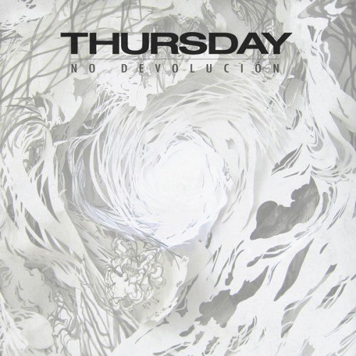
Thursday – No Devolucion
Your eye is drawn to the center of the white circle, and then you are dragged around. This is a wonder land of whites and grays. The solid black type makes it strong and meaningful.
Dance Gavin Dance – Downtown Battle Mountain Pt.II
There’s a lot going on with this cover, and sometimes a crowded design can be bad, but with this they hit it right on the head. Majority of the cover is in white and black, and only certain objects have color. You are forced to focus on the bright colors. It’s like a children book you wish you read as a child.
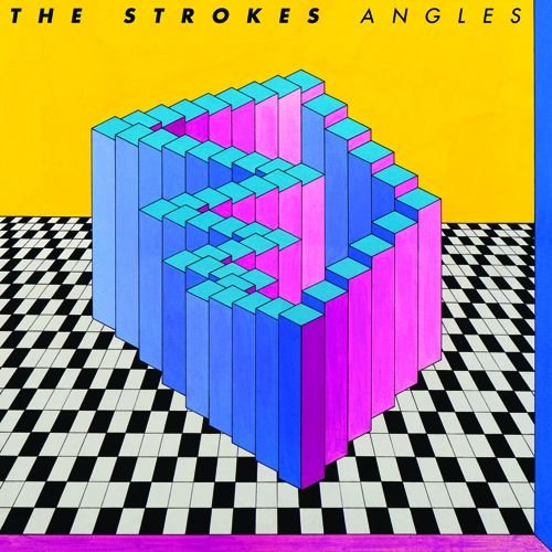
The Strokes – Angles
The title “Angles” matches this design perfectly. The colors are vibrant, and resemble a 80’s and 90’s feel. The angles of the focal point and floor titles have your eyes going everything. The flow and colors are phenomenal. This design is full of energy and happiness!